Bootstrap: Fluid Grid Exercise
The goal of this exercise use the responsive grids classes from Twitter Bootstrap to lay out a columnar website that fluidly resizes based on screen resolution
- Start with the starter code file
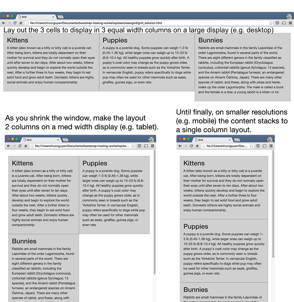
grid_starter.htmland cssgrid.cssby right clicking and saving the file it to your computer. - Use the Bootstrap grids classes to make the content a fluid layout according to the following:
Bonus: Add images, using the card group class to organize the content.
Play around with changing the styling (fonts, colors) by editing grid.css.
Or play around with adding more components!