Bootstrap
HTML & CSS Review, Frameworks, Content Classes
HTML & CSS Review ↓
Anatomy of a website
Your Content+ HTML: Structure
+ CSS: Presentation
= Your Website
Anatomy of an HTML element
- Element: An individual component of HTML
- Tag: Marks the beginning & end of an element with opening and closing tags
- Attribute: Provides additional information about the HTML element
- Value: What's assigned to a given attribute
What are some elements you learned?
Element Anatomy Quiz
<img src="selfie.jpg" alt="yours truly">
What is the element? Tag? Attribute? Value?
Nesting
Nesting is what happens when you put other containing tags inside other containing tags.
<ul>
  <li>
    <p>A paragraph inside a list item</p>
  </li>
</ul>
Incorrect:
<ul>
  <li>
    <p>A paragraph inside a list item</p>
  </ul>
</li>
Elements We Learned
- Paragraph
<p> - Heading
<h1>,<h2>, ... - Emphasis
<em>& strong<strong> - Anchor (link)
<a> - Image
<img> - Line break
<br> - List
<ol>,<ul>& list item<li> - Tables
<table>, etc. - Division
<div>, span<span> - Comments
<!-- -->
Anatomy of a CSS Rule
- Selector: Indicates which elements are affected
- Attribute: The element's feature that is affected
- Value: What's assigned to a given attribute
What are some attributes you learned?
CSS Rule Anatomy Quiz
.main img.polaroid {

                          border: 1px solid black;

                          padding: 0.5rem 0.5rem 2rem;

                    }
What is the selector? What is it selecting? What are the attributes? What are their values?
Add CSS to your HTML
Inline
Some text.
Embedded
<head>
</head>
Linked
<head>
  <link rel="stylesheet" type="text/css" href="style.css">
</head>
Properties We Learned
colorbackground-colorfont(and related)position
Specificity (in descending order)
styleattribute- ID
- Class
- Element
Block vs. Inline
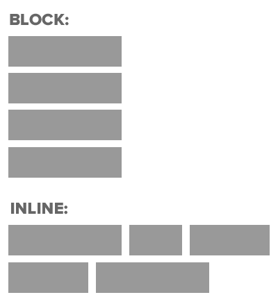
What are some block elements?
What are some inline elements?
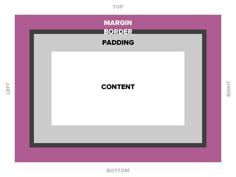
The Box Model
Frameworks ↓
What is a front-end framework?
A collection of production-ready HTML, CSS, JavaScript components that we can use in our designs.
CSS Frameworks - Usually include a reset, a grid system, styles for typography and forms. Some include support for mobile/print.
Javascript Frameworks - Gives structure to your JavaScript code and keeps it organized.
What is a front-end framework?
Responsiveness and cross-browser consistency for free.
Modular and reusable components.
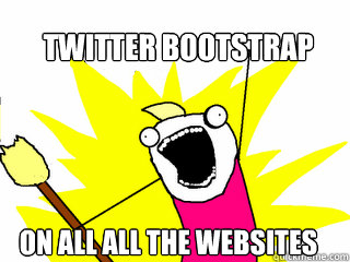
What is Bootstrap?
Bootstrap is a front-end UI (user interface) framework originally created by Twitter
Speeds up the development of new websites and web applications.
#1 Project on github with over 100k stars and 45k forks
Bootstrap is an open source project on GitHub, meaning anyone can contribute to its progress.

Why use Bootstrap?
Why reinvent the wheel? - Out of the box styles and components?
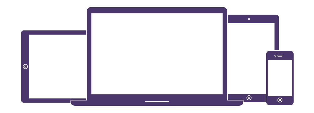
Designed to be responsive - HTML elements respond to changes in screen size.
Mobile-first - certain mobile-friendly styles (like the ability to zoom in) are included in the core files
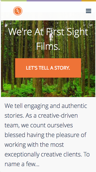
So this desktop design:
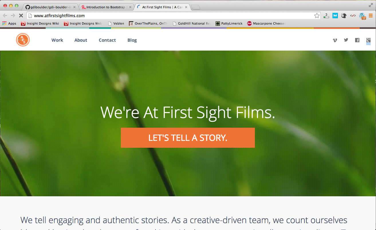
Also looks great on a tablet:

And rad on a smartphone!
Why would I want to use Bootstrap?
Bootstrap stylishly fast-tracks your web development. It's an excellent tool to get your project up and running in no time!
How do I use Bootstrap?
You can download all the necessary Bootstrap files from getbootstrap.com or from the Bootstrap repo on GitHub.
Embed the files on your .html page using a link element
You can also link to it from a content delivery network (CDN)
What Comes with Bootstrap? File Structure
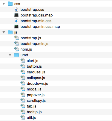
Layout:
Options for structuring your pages with Bootstrap, including global styles, required scaffolding, grid system, and more.
Content:
Styles for displaying content with some of the most commonly used HTML elements, including normalization, typography, images, tables, and more.
Components:
Over a dozen reusable components built to provide buttons, dropdowns, input groups, navigation, alerts, and much more.
See it in action!
Check out some of the components by opening the example.html file in your browser window.
How do I give it my own style?
Check Bootstrap documentation if there's an existing CSS class or style
Create your own separate CSS file (e.g. overrides.css)
Inspect the bootstrap element you want to customize and copy the selector into your overrides CSS file
Make sure to include your file after Bootstrap base CSS
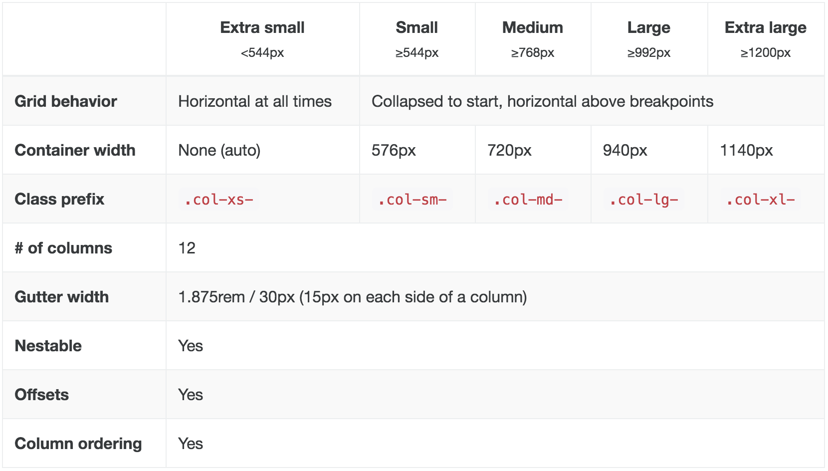
Bootstrap Grid System ↓
Bootstrap is based on a 12-column grid, and uses CSS classes to decide the width of each element.
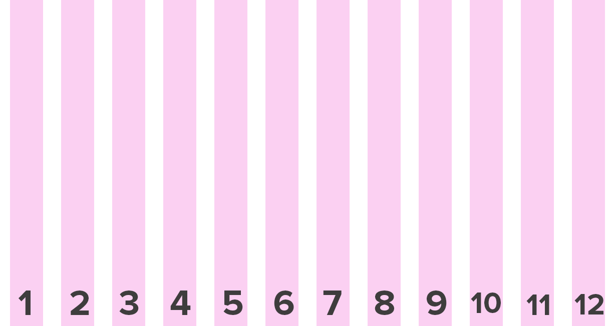
Each element can take up between 1-12 columns worth of space...
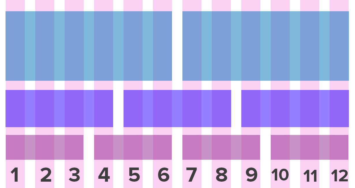
Some Rules:
- Rows must be placed within a
.container(fixed-width) or.container-fluid(full-width) for proper alignment and padding. - Use rows (
.row) to create horizontal groups of columns. - Content should be placed within columns, and only columns may be immediate children of rows.
Code Example
[CONTENT FOR ROW]
See it in action!
Open up columns.html in your browser window.
Resize your browser to see where the columns break to fit 100% of the width.
See it in action!
Open up columns-fluid.html in your browser window.
Resize your browser to see where the columns break to fit 100% of the width.
Column Classes
In other words...
If you want to have two 50% columns on a mobile phone, you would use .col-xs-6 nested in a .row, and the rows would be consistent on every device...
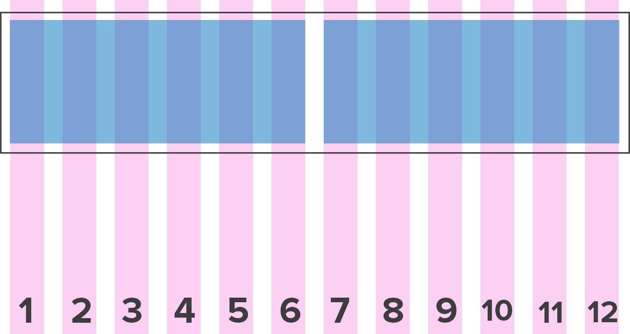
Two 50% width columns
            [COLUMN 1 CONTENT]


            [COLUMN 2 CONTENT]
Two 50% columns on a mobile phone
If you want to have four 25% columns on a desktop, and would like them to break to 100% on a tablet, you would use .col-md-3 nested in a .row.
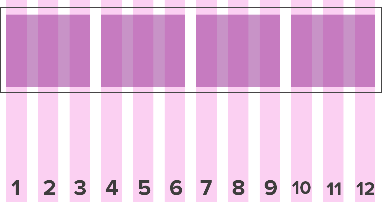
Four 25% width columns
            [COLUMN 1 CONTENT]


            [COLUMN 2 CONTENT]


            [COLUMN 3 CONTENT]


            [COLUMN 4 CONTENT]
Four 25% columns on desktop that break to 100% width on a tablet.
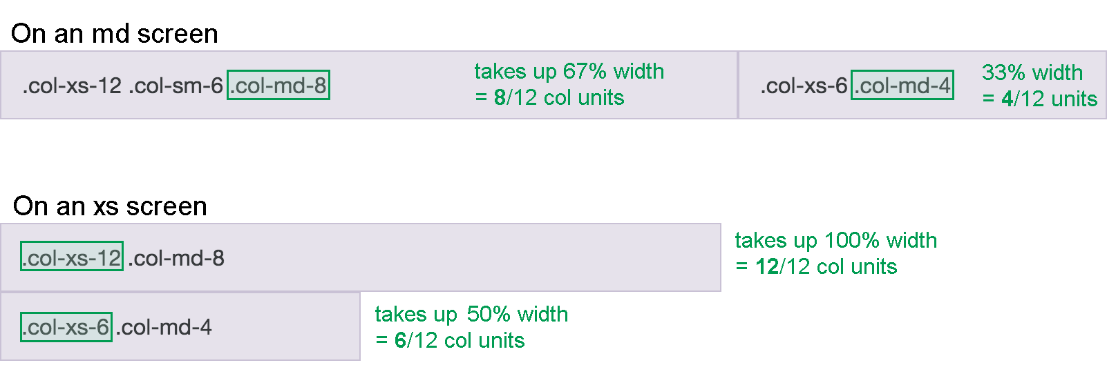
Multiple Grid Classes
            [COLUMN 1 CONTENT]


            [COLUMN 2 CONTENT]
Exercise: Grid
Content ↓
Typography
Bootstrap's base typography classes normalize headings, paragraph fonts, list styles and more.
Textual utility classes are also included for layout
Responsive Images
Images in Bootstrap 4 can be made responsive by adding the .img-fluid class.
Applies max-width: 100%; and height: auto; so it scales to fit the parent element.
Other Image Styles
.img-roundedapplies rounded edges.img-circletakes a square image and applies the styleborder-radius: 50%;.img-thumbnailapplies a border with rounded edges to the image